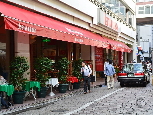
Green is the color of nature and harmony, positioned between warm and cool tones. It has an optimal balance, which makes it universally appealing. In the restaurant business, it creates a sense of comfort and relaxation, making it a popular choice for interiors, storefronts, and menus.
How Green Affects Restaurant Perception
Green reduces stress, eases eye strain, and brings a sense of calm. If a restaurant’s goal is to provide a peaceful and relaxing experience, this color is ideal for interior design, displays, and menus.
Additionally, green inspires trust, which is why it is commonly used in pharmacies, healthcare facilities, and medical uniforms. Light shades of green are particularly popular for doctors’ and medical staff attire, reinforcing their professionalism and care.
This color is also associated with a healthy lifestyle and natural nutrition, making it perfect for fruit and vegetable stores, cafés in fitness centers, and restaurants specializing in vegetarian cuisine.
When used correctly, green helps create a comfortable and eco-friendly atmosphere, making it an excellent choice for businesses that emphasize health-conscious dining and sustainability.
Blue color in health products stores
Psychologists consider blue the most popular color worldwide, as it is associated with intelligence, precision, and sincerity. However, scientific studies confirm that blue reduces appetite, mainly because it is rarely found in natural foods.
How Blue Affects Restaurant Perception
Blue suppresses hunger, making it a risky choice for restaurants. The exception is high-end establishments specializing in diet cuisine, where sales depend on the exclusivity and high cost of dishes rather than volume. These restaurants typically cater to loyal, regular customers.
This color is not suitable for storefronts, billboards, or restaurant signage during cold seasons, as it fails to evoke warmth and comfort, potentially reducing foot traffic.
However, blue has a calming effect: it reduces stress, stabilizes heart rate and blood pressure, and lowers body temperature. For this reason, it is ideal for healthcare facilities, pharmacies, and displays featuring health-conscious or diet-friendly products.
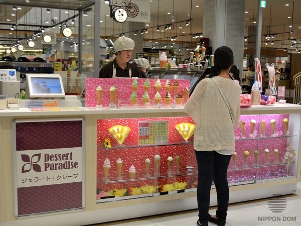
During hot weather, blue enhances the feeling of coolness and freshness, making it an excellent choice for beverage and ice cream display designs.
When used correctly, blue can be beneficial in the restaurant industry, but it should be applied strategically, depending on the type of establishment.
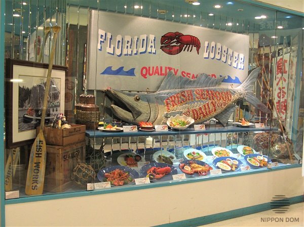
Blue color in catering facilities design is appropriate only for facade elements and decoration of fish restaurant. In this case, blue color should be closer to green color.
Purple color in places for comfortable pastime
Purple is one of the most controversial colors. Some see it as royal and luxurious, others as calm and sophisticated, while some find it vulgar and inappropriate, and others associate it with mystery and intrigue. However, designers agree that purple has a strong psychological impact.
How Purple Affects Restaurant Perception
Purple reduces stress and promotes relaxation, making it suitable for therapy rooms, rehabilitation centers, beauty salons, and wellness spaces. People experiencing depression often find purple appealing, which explains its popularity in bedrooms and calming environments.
In the restaurant business, purple suppresses appetite, meaning that restaurants with a dominant purple palette may struggle with sales and profitability. This color does not naturally stimulate hunger, making it unsuitable for most dining establishments.
Additionally, purple is often ignored by younger audiences, as it is associated with wisdom and maturity rather than fun and excitement. For young customers, it may feel too serious, making it an impractical choice for cafés and restaurants targeting a lively, youthful crowd.
When used correctly, purple can add a sense of elegance and depth to an interior, but in the restaurant industry, it should be applied cautiously.
White color in laboratories, interiors and uniform
White is the brightest color in the spectrum, as it reflects natural and artificial light, enhancing overall illumination. This makes it a popular choice for creating a sense of space, cleanliness, and lightness.
How White Affects Restaurant Perception
White symbolizes cleanliness and sterility, which is why it is commonly used in healthcare facilities, laboratories, stores, and food establishments. It highlights hygiene and neatness, creating an impression of order.
However, an excess of white can feel too cold and unapproachable, potentially making some people uncomfortable. In many hospitals worldwide, staff uniforms are pink or beige because these colors build trust and encourage friendly communication. This effect can also be beneficial in restaurants aiming to create a warm and inviting atmosphere.
Additionally, white visually expands space, making it ideal for small rooms and low-ceiling areas. White furniture and light-colored walls reflect light, creating a feeling of openness and reducing the sense of confinement.
When used correctly, white adds elegance and airiness to interiors, but it should be combined with other tones to avoid a sterile appearance.
Black – The Color of Luxury: How to Create a Premium Brand Image
Black has always symbolized luxury, status, and prestige. It represents high social standing, emphasizing exclusivity and sophistication.
How Black Affects Restaurant Perception
Black is associated with premium quality, which is why it is widely used in the facades and advertising of high-end restaurants and luxury stores. This color creates a perception of superior products and services, attracting wealthy clientele.
A black facade signals a high price range, indicating that the establishment offers exclusive dining experiences with top-tier service. If a restaurant targets an upscale audience, incorporating black can reinforce its prestige and increase profitability.
However, black slows digestion and reduces appetite, making it unsuitable for restaurant interiors. Excessive use of dark tones indoors may create a heavy, unwelcoming atmosphere, potentially discouraging customers from staying longer.
When applied strategically, black becomes a powerful marketing tool, positioning a brand as elite and exclusive.
Black color in restaurant’s facade “tells” about high quality of service and high prices.
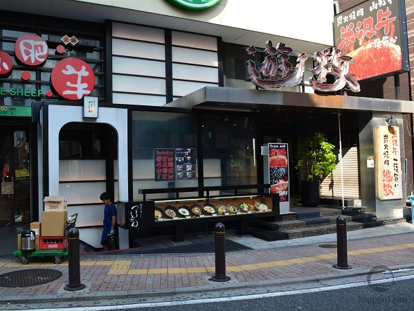
Brown in Interior and Exterior Restaurant Design
Through extensive analysis and experimentation, Japanese marketers have recognized brown as a universal color for restaurant interiors and facades. It creates a comfortable and stable atmosphere, making it ideal for relaxing, cozy environments.
How Brown Affects Restaurant Perception
Brown has a positive psychological effect, fostering calmness, warmth, and security. Restaurants with brown interiors make guests feel relaxed and at ease, providing a mental escape from the noise and stress of daily life. A beige-brown color scheme encourages customers to return.
This color offers a rich variety of shades. While classic brown may seem ordinary, its spectrum includes caramel, sand, walnut, chocolate, chestnut, cream, brick, coffee, and many others, adding natural warmth and elegance to the space.
Brown is highly practical, requiring less maintenance than lighter colors and hiding dirt better than white furniture or glossy surfaces.
It is also easy to combine with other colors. The various shades of brown blend harmoniously, tying together floors, ceilings, walls, furniture, and decorative accents into a cohesive design.
Brown appeals to all age groups, making it a popular choice for traditional restaurants, family-friendly venues, cafés, bars, fast food establishments, and vegetarian eateries. It complements both classic and ethnic designs, as well as modern internet cafés.
Brown also enhances appetite, as its shades naturally complement food colors, highlighting the richness of berries, fruits, and meals. As a result, dishes and beverages appear more flavorful and visually enticing.
When used effectively, brown creates a warm and welcoming atmosphere, making a restaurant both inviting and aesthetically pleasing for guests.
All shades of brown perfectly fit for external display windows design and interiors of almost all catering facilities.
Warm and Cool Shades in Restaurant Design and Advertising
Warm shades (red, orange, yellow) make objects appear closer and larger, while text on price tags looks bolder and more prominent. Because of this, warm colors are ideal for advertising, as they effectively draw customer attention. In winter, a warm color palette creates a sense of coziness and comfort, making it a great choice for outdoor storefront displays.
Cool colors create depth and a sense of distance, making them useful for visually enlarging spaces. In interiors, they help expand a room, creating a feeling of openness and airiness. Refrigerated displays featuring cool tones enhance the refreshing appeal of drinks and ice cream, making them even more enticing on hot summer days.
When applied strategically, warm and cool shades influence spatial perception and customer emotions, helping to create effective advertising and a welcoming atmosphere.
The Relationship Between Time and Color in the Restaurant Business
Studies on why some restaurants keep customers for longer while others encourage quick turnover have revealed that interior colors influence the perception of time.
How Colors Affect the Sense of Time
Warm tones (red, orange, yellow) speed up perception, increase blood pressure, and quicken pulse and breathing. In warm-colored interiors, time seems to pass faster, making these hues ideal for fast-food restaurants, buffets, and casual cafés, where quick service and high customer turnover are essential.
Cool colors (blue, green, purple) have a calming effect, encouraging thoughtful decision-making and prolonged stays. In spaces dominated by cool shades, time feels slower, making them suitable for pharmacies and luxury retail stores, where customers need to browse carefully and make informed choices.
In high-end restaurants, cool tones should be used carefully, especially in venues where guests engage in long conversations, discuss business contracts, and enjoy a refined atmosphere. These establishments profit from exceptional service and premium pricing, rather than rapid customer turnover.
By strategically applying color psychology, restaurant owners can influence customer flow and create an atmosphere that aligns with their business model
How Color Palettes Influence Temperature Perception
Colors affect the way we perceive temperature, creating a sense of warmth or coolness. Studies show that color choices can make a space feel up to 3 degrees warmer or cooler.
Color Order Based on Heat Perception
Red → Orange → Yellow → Green → Purple → Black → Blue
Warm colors (red, orange, yellow) create a cozy, warming effect, making them ideal for storefronts and interiors during winter to attract customers by enhancing a sense of warmth and comfort.
Cool colors (blue, black, purple) visually cool a space, making them perfect for summer, as they evoke freshness and a cooling sensation.
To maintain consistent customer traffic year-round, Japan integrates a mix of warm and cool colors in storefronts, restaurant interiors, and displays. This balances temperature perception and creates a comfortable atmosphere for guests.
How Color Affects Weight Perception
Scientific studies confirm that color influences how we perceive an object’s weight. Two identical objects in size and mass can feel heavier or lighter depending on their color.
Experiment: How Color Changes Weight Perception
Researchers conducted a test where identical 100 g boxes were painted in different colors. Participants were asked to estimate which box felt the lightest and which felt the heaviest.
Results showed that white was perceived as the lightest color, while black felt nearly twice as heavy as white.
Perceived Weight Distribution in the Experiment:
- White box – 100 g
- Yellow box – 113 g
- Yellow-green box – 132 g
- Blue box – 152 g
- Red box – 176 g
- Purple box – 184 g
- Black box – 187 g
This effect is essential to consider in interior design, product packaging, and advertising, as color can subconsciously alter how consumers perceive objects and brands.
Color brightness in display windows design
Light and bright objects appear visually lighter, while dark colors feel heavier. This principle is widely used in supermarket and storefront design to create a pleasant shopping experience.
When arranging displays, it is important to note that light-colored packaging is placed at eye level or higher, as it attracts attention and enhances a sense of lightness. Darker packaging is positioned lower, ensuring it does not create visual pressure, allowing customers to browse comfortably.
Strategic use of brightness and color contrast helps increase product appeal and guide customer attention to key areas of the display.
The power of light
Each color and its shades influences people in different ways. The goals of your business should be determinative factor for choosing color scheme of interior, facade, display windows and marketing tools. The objects for design matter too: sign or billboard for catching attention, store’s display window to increase sales rate, or interior for comfortable leisure time of your visitors.
Correct color scheme will contribute to the success of your business.
Irina Myronova, July 2015