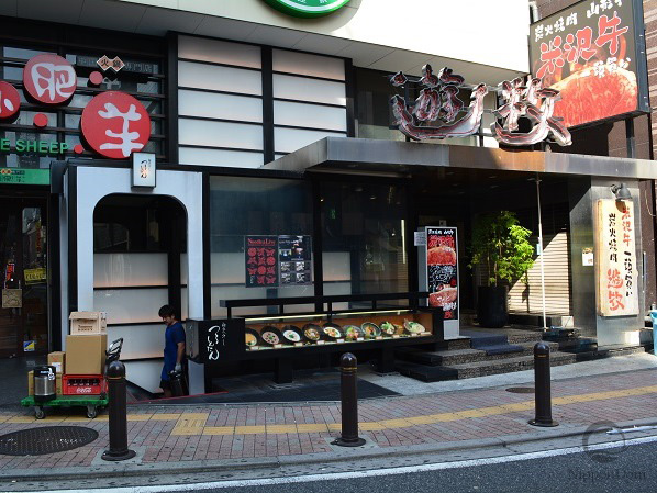
A food replica tells the pedestrian “this is what you’ll get.” A price tag tells them “this is what you’ll pay.” A window display with one but not the other does only half the job — and loses customers at the door. This short guide walks through why food replica price tags are non-negotiable, what a working tag actually looks like, and a few Japanese standards that quietly do more for foot traffic than most owners realize.

A Food Replica Without a Price Tag Does Half the Work
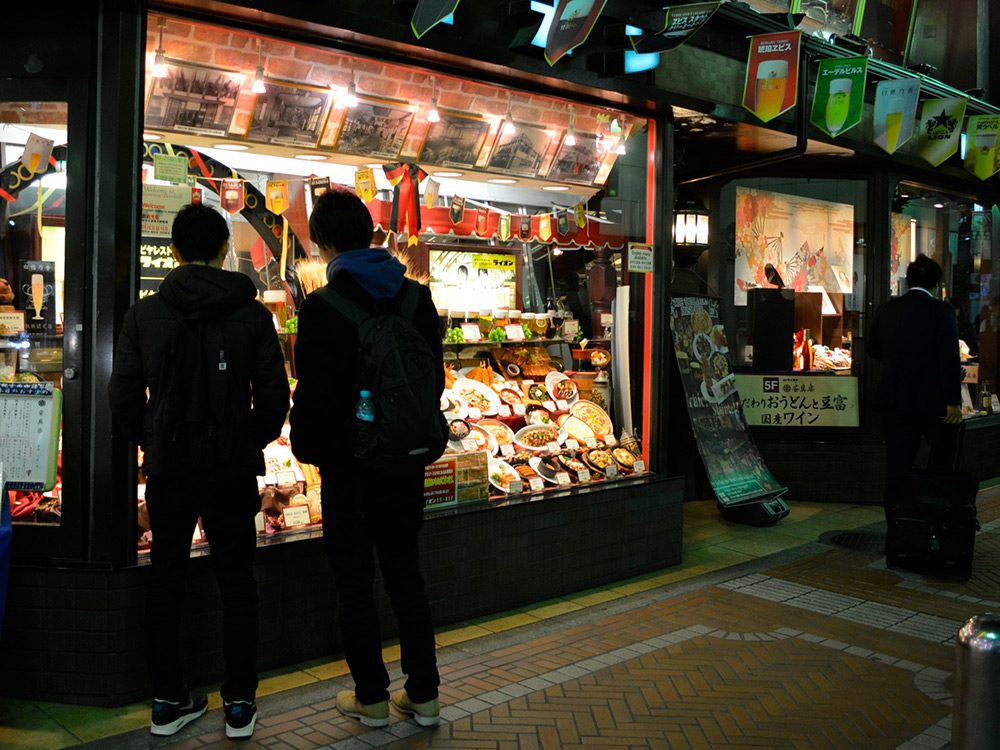
The point of a food replica is to remove uncertainty. The pedestrian sees the portion, the ingredients, the presentation — and immediately knows what they would get if they walked in. But that’s only the first half of the unspoken question every passerby is asking: what will it cost me?
Without a price tag, the brain fills in the worst case. The pedestrian sees a beautiful dish, assumes it might be expensive, and keeps walking — even if the actual price would have been perfectly comfortable. A price tag closes that loop instantly. Combined with the replica, it becomes a silent contract: this is the dish, this is the price, no surprises inside. This is why Japanese restaurants have used the replica-plus-price formula for nearly a hundred years, and why our guide to restaurant window display design lists pricing as a foundational element, not an optional one.
What a Working Price Tag Looks Like
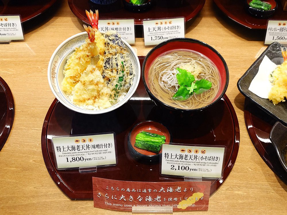
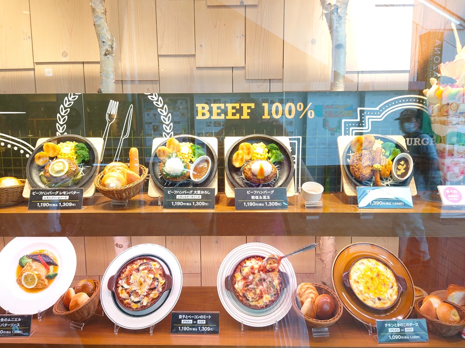
The Japanese standard for a price tag is quietly precise. A compact rectangular card sits directly below or in front of the replica. The dish name comes first, in clean readable type. The price comes second, slightly smaller. Every tag in the window uses the same format, the same height, the same typography. The result reads as one calm system, not a collection of stickers.
A working tag carries three pieces of information at minimum: dish name, price (always tax-inclusive, in line with the Japanese sōgaku hyōji standard), and — when it adds value — a one-line note about composition or portion. Anything more starts to compete with the replica itself. Less is almost always more.
Add a Number — and a NEW Flag: The Japanese Speed Trick
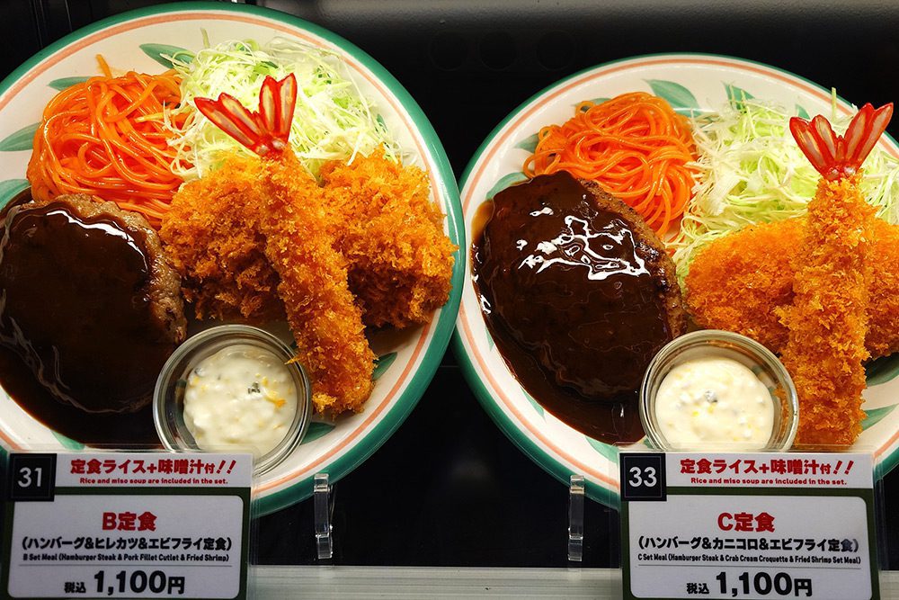
Almost every food replica display in Japan adds one element Western restaurants rarely use: a number. Each dish gets a digit — usually inside a small box on the left side of the tag — and the customer orders by saying “twenty” instead of “set meal C with hamburger steak, crab cream croquette, and fried shrimp.”
Three things happen at once. Order time drops from thirty seconds to one. The language barrier for foreign tourists disappears — they don’t need to pronounce the dish name, only the digit. And the social hesitation of guests who aren’t sure how to pronounce an unfamiliar word disappears with it. In a restaurant with three servers during lunch rush, this saves measurable minutes of cumulative service time per shift, and it raises the order rate from tourists in airport, train station, and tourist-area locations significantly. The numbered tag is one of the highest-leverage details a window display can add.
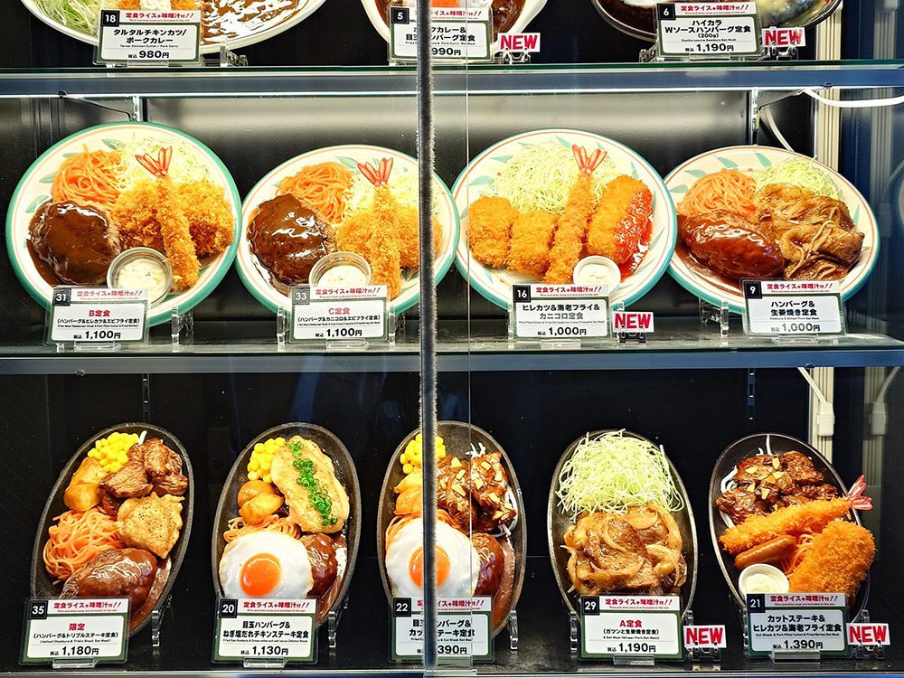
The same tag system solves a second problem: showing the pedestrian what’s new in the menu. A small “NEW” flag in a contrasting color attached to the regular tag reads from across the street. The eye lands on the new item first, the rhythm of identical standard tags is broken, and the brain registers novelty without needing to read every dish. The flag costs almost nothing to add and turns a static window into a dynamic one every time the menu changes.
Tag Color Signals the Class of Your Restaurant
Color reaches the pedestrian’s brain before the digits do. The shade of the tag positions the restaurant before the price has even been read.
- Black, dark brown, or dark navy on a light background signals premium, confident, fine-dining — used in steakhouses, premium dessert boutiques, high-end izakaya.
- Red, orange, or yellow signals urgency, appetite, accessible price, and discounts — used in fast food, burger shops, pizzerias, and on “limited time” promotions.
- White or cream (neutral) is the safe universal choice — works for almost any format and lets the food do the talking.
- Green or kraft brown signals natural, organic, farm-to-table, locally sourced — used in healthy cafes, vegan kitchens, and organic restaurants.
- Gold or metallic accents signal premium positioning or anniversary specials — best used sparingly, on individual hero items inside a premium window.
A mismatch costs traffic. A premium steakhouse with red-and-yellow tags reads as fast food in the pedestrian’s brain, and the dish at $80 stops looking believable. A burger shop with black-and-gold tags reads as overreach and quietly discourages its real audience. For a deeper dive into how color shapes restaurant perception, see our article on the power of colour in restaurant advertising.
Seasonal Tags and Multiple Price Variants
Two more reliable methods keep a window pricing system alive over time.
The first is a different tag color for seasonal or holiday items. Spring blossoms, autumn maple tones, winter pine — tag color shifts in sync with the season, and it pairs naturally with the seasonal decor inside the window. The pedestrian receives a double trigger: the decor signals the season, the tag confirms there’s a dish to match. Seasonal tags fit naturally with the principles from our guide to restaurant window decoration ideas — refreshing tags alongside refreshing decor doubles the impact of both.
The second is two price variants of the same dish on adjacent tags. Useful when portion size, set composition, or extra side dishes change the price. The visual comparison itself becomes the upsell: the pedestrian sees the “regular” and “upgraded” versions side by side and reaches the decision before reaching the door.
Common Mistakes That Quietly Kill Sales
- Different tag formats in the same window. Reads as visual chaos and undermines the calm professionalism the rest of the display works to build.
- Price set in larger type than the dish name. Puts the spotlight on cost instead of appetite.
- Faded, peeling, or yellowed tags. Signals “nobody is minding this place” — and the rest of the restaurant gets read through that lens.
- A tag with no replica next to it. Loses around 80% of the impact a replica-plus-tag pair would deliver.
- A replica with no price tag. Loses around 50% of the impact a replica-plus-tag pair would deliver — and that’s the gap this whole article is about.
A food replica is half of a sales instrument. The price tag is the other half. Together they form a complete silent contract with every pedestrian who passes your window: this is the dish, this is the price, walk in with confidence. Skip the tag, and you’ve paid for an inventory display. Add the tag — with a number and the right color — and you’ve built a tool that works 24/7. Even when the restaurant is closed, the window keeps doing its job: pedestrians look at the dishes, check the prices, and plan when to come back. A working tag converts not just lunch traffic, but every passerby who walks past at night and remembers the place by morning.
Ready to build a window that actually sells?
Order custom food replicas from Tokyo masters — and let us help you set up the perfect price tags alongside them.
Related Posts
Restaurant Window Decoration Ideas: Seven Types of Decor That Stop Pedestrians and Bring Customers In
Restaurant Window Display Lighting: A Japanese Expert’s Guide to Making Food Look Irresistible
Kids Menu Design Ideas for Family Restaurants and Cafés
Dinnerware Marketing Ideas: How to Increase Sales in Retail Stores
Restaurant Pricing Psychology: How the Magic of Numbers Boosts Sales