The power of color in restaurant business
How color design of the interior brings new clients and increases sales
Scientists’ researches proved, that 83% of information is perceived through visual organs, and 80% of it is color perception. Which means, that we get almost 70% of information about the world through the variety of color palette. Following researches results, marketing specialists named eight main colors, which influence behavioral factor and purchasing ability of the customers.
Correct color design of interior and display windows in restaurant business ensures new customers and increase sales rates. The main task here is to know your target audience, identify tasks and set a goal. Then you can start designing your interior, banners, facade and external display windows.
Red color in interior, display windows and billboards
When display windows, banners and interior are designed, the following psychological aspects of red color influence should be noted:
- Activation of nervous system, fast fatigability and tiredness. People eat faster in areas, where red color predominates. Red color is a perfect decision for catering facilities, aimed at high turnaround and fast releasing of spots.
- Appetite stimulation, especially if alcohol is served. A good feature for bars, if it was not for a danger of uncontrolled aggression. In order to avoid negative affect of strong liquor, designers suggest using high partitions between tables in areas with red color.
- A sense of warmth. People will subconsciously choose a cafe with red facade during cold season, especially if the weather is bad.
- Association with pain and blood gives anxiety and fear. Red color does not fit for pharmacies, hospitals, kids cafes.
- Visibility from the distance. Red is the color with the longest waves, visible for human eye. People see red advertisement in the first place. That is why restaurateurs use red color, when designing external banners, billboards and sunshade awnings.
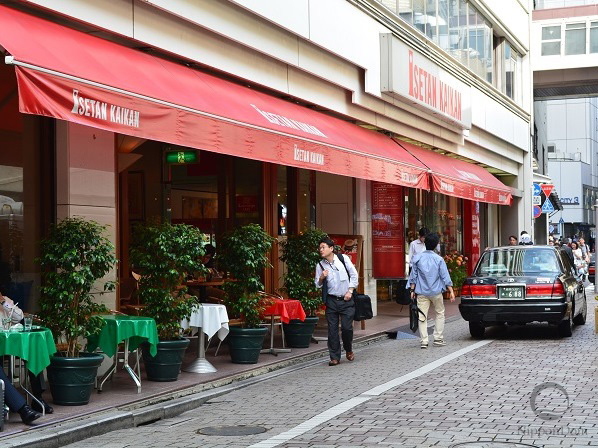
Red color in cafe design catches attention from the distance.
Orange color stands for low price range
Marketing specialists came to an interesting and unusual conclusion: orange color boosts spirits and cheers up, but it is also associated with cheapness. Too much of orange color in premium-class restaurants will cause decrease of reputation and partial loss of customers. Subconsciously, orange color:
- Is opposite to luxury and expensiveness. Suits for modern catering facilities, fast foods, canteens. It is also used to design low-and medium prices range facilities, which specialize on business lunches, set lunches and dinners.
- Stimulates appetite. However, it is important to remember that orange color may be used as an accent color only. Overwhelming of this color annoys people and makes them want to leave the place as soon as possible.
- Boosts spirits. This feature is useful for sports goods stores, separate shelves with sports nutrition, gyms, sports areas and sports bars. This color is suitable for places, where cheerful and relaxing atmosphere is required.
- Catches attention. The length of orange color ray is second-longest after the red one. Orange color is visible from the distance against other colors, but people prepare for low price range in advance.

Orange color in facade design shows low prices range of the facility and attracts customers, which want to have a meal at a reasonable price.
Pink color in cosmetics shops and kids cafes interior
Pink color is pretty close to the red one on the palette, but is more soft and calming; it reduces adrenaline level and emotional stress. Pink color affects you on subconscious level:
- It makes you feel safe and trust. Designers recommend to use pink color for interiors (and uniform) of pharmacies, healthcare organizations, kids cafes and stores.
- It is associated with youth, freshness and beauty. For example, pink color is pretty common in USA cosmetics shops. Beauty shops owners also use pink colors of various shades, and mix them with other colors.
- It stimulates appetite. Pink is not recommended for shelves with diet products. Whereas it would be perfect for desserts models in a display window.
- It reminds of childhood and youth, when people did not bother about status or finances. Restaurateurs should keep it in mind, that strong expensive alcohol drinks and dishes for them will not be popular in pink interior.
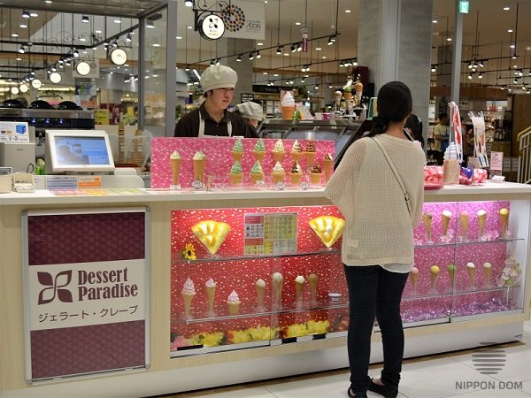
Pink display window with ice cream in a mall attracts attention of visitors with children.
Yellow is the color of young and active people
Yellow color stimulates brain activity, improves reaction, contributes to development of imagination, and increases concentration. Restaurant business specialists recommend being careful using this color in the design of display windows, banners and interiors. Yellow color:
- Gives sense of light and energy. That is why it suits for places for young people. For example, in cafe or restaurant, where majority of clients are young people. Adults, especially women, don’t feel comfortable in rooms with lots of yellow color, which sometimes gives a bad shade to mature skin.
- It is associated with death in Europe and Asia. You should avoid predominance of yellow color in display windows of certain national cuisines.
- Indicates low prices. It is recommended to use it for price tags of discount goods and for shelves with essential goods.
Green color in healthy foods and vitamins shops
Green color is located on the boundary of warm and cold colors in the palette. All shades of green are associated with nature. Scientist claim, that it has a perfect balance, so many people like it. From psychology standpoint green color:
- Reliefs stress, removes eyes strain, relaxes, gives a feel of comfort. Green color is perfect for display windows of restaurants or cafes, aimed at calm and relaxing rest for their visitors.
- Gives a feel of confidence. Green color is suitable for design of pharmacies and healthcare organizations. Light green is often used for doctors and medical staff uniforms.
- Highlights healthy lifestyle and healthy food. Green interior and display windows look great in fruit and vegetables stores, sports centers cafes and in vegetarian catering facilities.
Blue color in health products stores
Psychologists consider blue color to be the most favorite color in the world; it is perfect for lots of design tasks. Most people associate it with spirit, intelligence, accuracy and honesty.
However, experience has proved, that all shades of blue suppress appetite. For blue is very rare color in natural products. The color of some vegetables or berries, for example, eggplants or blueberry is not purely blue, but purple with a bit of red.
There was no blue food during human evolution. So now, even if we see any blue object, we don’t associate it with tasty food. Considering this fact, you should mind the following when applying blue color:
- It suppresses appetite. Blue color must be used carefully in restaurant business. There is an exception – a diet kitchen with high prices range. In this case, sales will increase due to expensiveness of rare diet dishes, but not due to frequent orders. Such cafes and restaurants are usually aimed at loyal customers.
- Doesn’t suit for display windows, banners and billboards of catering facilities during cold season. Potential customers will not associate it with warmth and comfort, and will just pass by.
- Reliefs stress, normalizes heart rate, blood pressure and breath, lowers temperature. It is recommended for interior of healthcare organizations, pharmacies, as well as for display windows with diet products and health goods.
- Brings you feel of coolness and freshness in hot days. It is recommended to use the color in display windows with refreshments and ice cream during hot season.
Blue color in catering facilities design is appropriate only for facade elements and decoration of fish restaurant. In this case, blue color should be closer to green color.
Purple color in places for comfortable pastime
People treat purple color differently. Some of them consider it a royal, luxury and expensive color. Some think it is calming and high-status color. Some find it vulgar and inappropriate. The others consider it enigmatic and mysterious. But all designers agree, that purple color:
- Reliefs stress and brings calmness. Depressed people find purple color beautiful, that is why shades of purple color are recommended to be used in rehabilitation centers, and psychotherapy offices. It is suitable for bedrooms, beauty shops and relaxation rooms.
- Suppresses appetite. Restaurants and cafes with mostly purple palette will have neither high sales rate, nor increase of income.
- Is ignored by young people. Careless and cheerful young people consider purple color to be too adult, wise and mature.
White color in laboratories, interiors and uniform
White color reflects natural and artificial rays perfectly, which makes it the brightest in all palette of colors. That is why it is often used to intensify illumination. From psychological viewpoint, white color:
- Gives an impression of purity. It is used to highlight sterility in healthcare organizations, laboratories, stores and catering facilities.
- Many people think white color is too beautiful and unreachable, which causes feeling of inferiority. In most clinics all over the world, staff’s uniform is made in pink or beige colors. They inspire confidence and encourage friendly conversation. Patients contact medical staff easier, and feel less stressed.
- Visually widens space. Suits for small rooms and for making the feel of height if the ceiling is low. White furniture will reflect light in the room and will remove a feel of pressure in small areas.
Black color in interiors of expensive facilities
Black color has always been considered as noble, expensive and imposing; this perception remains nowadays. Black color stands for high status of a person in social hierarchy. In business-interior it:
- Indicates high quality of products and services. That is why it is widely used in facade design and advertising of expensive and luxury restaurants and stores.
- Highlights high prices level. Restaurant’s facade in black color shows high quality and expensiveness. If your customer is rich, black color of facade will bring those customers and increase profit.
- Slows down digestion and suppresses appetite. Doesn’t suit for interior design of catering facilities.
Black color in restaurant’s facade “tells” about high quality of service and high prices.
Brown color in interior and exterior design
Thorough analytic work and experiments by Japanese marketing specialists proved, that all shades of brown are suitable for catering facilities’ interiors and facades. From specialists viewpoint, brown color:
- Has a positive influence on psychological level. A special atmosphere prevails in brown rooms, where people can relax, calm down, feel safe and secure. No wonder, that this color not only makes people relaxed and sober-minded, but also ensures psychological relaxation after hard working day in noisy and crowded space, and strong emotions. Restaurants, designed in beige and brown colors make customers think “I want to come here again”.
- Has a wide palette of shades. Classic brown color seems boring for most of people. However, if we look at its spectral range, we’ll see lots of natural shades: caramel, sand, walnut, chocolate, chestnut, ivory, ice-cream, terracotta, champagne, white coffee – just to start with.
- Is user-friendly. No doubt, that it is much easier to keep brown furniture clean, than to clean white sofas regularly, or to polish fashionable laminated decorative components or sparkling fittings.
- Is easy to apply together with other colors. All shades of brown color in the palette can be combined to create a solid composition of all interior parts: floor, ceiling, walls, furniture and decorative accessories.
- Is treated positively by people of all ages. Brown color shades may be used in restaurants with national cuisine and family restaurants, cafes, karaoke bars, fast food courts, vegetarian and diet restaurants. It suits for design of both classic and ethnic interiors, as well as for modern internet-cafes.
- Intensifies appetite. All shades of brown look good with most of colors of natural products, highlighting rich color of berries and fruits, which makes food and drinks look fantastic.
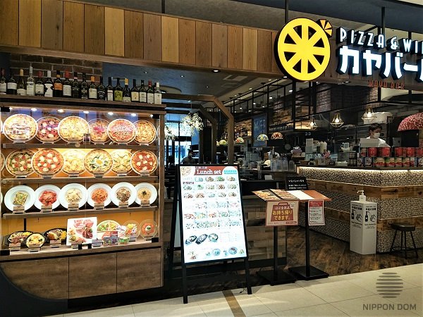
All shades of brown perfectly fit for external display windows design and interiors of almost all catering facilities.
Warm and cold colors
Warm colors (red, orange, yellow) visually draw objects nearer and enlarge them, so letters on price tags look bigger and wider. That is why warm colors are recommended for advertising. Warm palette is more suitable for external display windows at wintertime, this way they will give sense of warmth and comfort right at the entrance.
Cold colors give impression of depth and distance. They are recommended to be used for enlarging space and depth of the room. Cold colors of refrigerated cases will highlight cool drinks and cold ice cream at a hot summer day.
Correlation of time and color
Studying of reasons why customers stay in some restaurants for a long time, but leave the others pretty fast, brought to a surprising result. It appeared that interior color influences time perception.
All shades of warm palette raise blood pressure, increase heart rate and breath. Time flows fast in interiors of warm colors, so they are perfect for fast food restaurants, buffets, food courts and cafes.
On the other hand, cold shades calm down, invite to thorough choosing, and set you for a long leisure time. Time in areas with cold colors flows slowly.
Cold colors are suitable for places, where people need to choose goods carefully, for example in pharmacies or expensive stores. It can be carefully used in expensive first-class restaurants, where visitors communicate, have a rest, discuss business contracts or enjoy classic music. Profit in such restaurants is ensured by the highest level of service and high prices.
Influence of color palette on temperature perception
Colors are divided into those, which make you feel warmth, and those, which give you sense of coolness. People feel temperature differently (3-degrees difference), depending on color.
See main colors, in order of temperature perception:
Red => orange => yellow => green => purple => black => blue
In order to bring customers, it is recommended to design banners and interior in warm colors in winter and in cold colors in summer. Japanese specialists combine warm and cold colors in stores, restaurants and cafes signs to keep attendance at the same level during a year.
Color influence on weight perception
It is proved, that same objects of different color feel different in weight.
Scientists made an experiment: they covered boxes, identical in size and weight (100 gr) with different colors. Test persons were suggested to guess preliminary weight of the boxes. All of them considered white box to be the lightest. Whereas black box felt almost twice heavier, than the white one.
Weight perception appeared to be as follows:
- white box – 100 gr.
- yellow box – 113 gr.
- yellow-and-green box – 132 gr.
- blue box – 152 gr.
- red box – 176 gr.
- purple box – 184 gr.
- black box – 187 gr.
Color brightness in display windows design
Light-colored and bright objects seem light; the dark ones seem heavy. This feature is widely used for supermarkets design. While setting goods on shelves, keep in mind, that light-colored objects should be placed at eye level. Dark objects are usually put lower, not to “push”, so that customers may study goods better.
The power of light
Each color and its shades influences people in different ways. The goals of your business should be determinative factor for choosing color scheme of interior, facade, display windows and marketing tools. The objects for design matter too: sign or billboard for catching attention, store’s display window to increase sales rate, or interior for comfortable leisure time of your visitors.
Correct color scheme will contribute to the success of your business.
Irina Myronova, July 2015
